All you need is CSS

Анна Селезнёва, Evil Martians

All you need is CSS

MinskCSS Meetup #1

Привет!

Меня зовут Анна Селезнёва, и я марсианка

				.arrow {
	position: relative;
	width: 1em;
	height: 1em;
}
.arrow::before, .arrow::after {
	content: '';
	position: absolute;
	border-width: .2em;
}
			
				.arrow::after {
	width: ;
	height: ;
	border-top-style: solid;
	border-right-style: solid;
	transform: rotate(45deg);
}
			
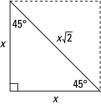
				 = 1em / 2 * sqrt(2) = .7em
.arrow::after {
	width: .7em;
	height: .7em;
	top: .15em;
	left: .15em;
}
		

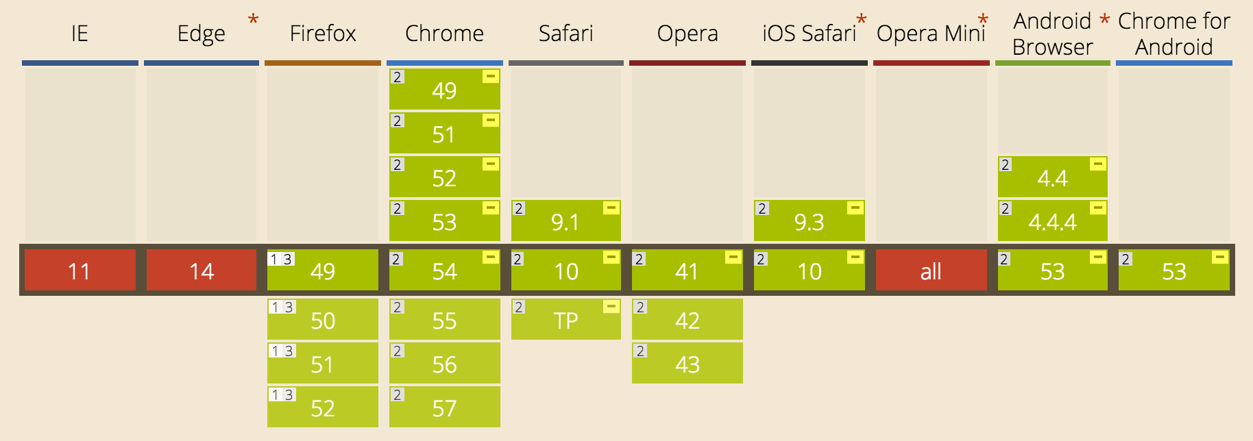
Во всех примерах считается, что значение box-sizing: border-box

				.arrow::before {
	top: .4em;
	width: ;
	border-top-style: solid;
}
			
				
 = 1em - (.2em / 2) = .9em
				
			
				.user {
	width: 1em;
	height: 1em;
}
.user::before,
.user::after {
	content: '';
	display: block;
	background-color: currentColor;
}
			
				.user::before {
	width: .45em;
	height: .45em;
	margin: 0 auto;
	border-radius: 50%;
}
			
.user::after {
	margin: .05em auto;
	width: .8em;
	height: .5em;
	border-radius: 100% 100% 0 0;
}
			
.user::after {
	margin: .05em auto;
	width: 1em;
	height: .5em;
	border-radius: .5em .5em 0 0;
}
			
.triangle {
	position: relative;
	width: 200px;
	height: 320px;
	overflow: hidden;
}
			
.triangle::before {
	content: '';
	position: absolute;
	left: 100%;
	width: 100%;
	height: ;
	background: #000;
	transform-origin: 0 0;
	transform: rotate(32deg);
}
			

 = 100% / cos(32deg) = 118%

.triangle::before {
	height: 118%;
}

			
.parallelogram {
	position: relative;
	width: 400px;
	height: 200px;
}
			
.parallelogram::before {
	width: 71.1%;
}


️ = 100% * height / width = 50%
 = 50% * tan(30deg) = 28.9%
 = 100% - 28.9% = 71.1%


I have a pen

I have a code

Ugh!

CodePen

.parallelogram {
	pointer-events: none;
}
.parallelogram-content {
	pointer-events: auto;
}
			

I have a pen

I have a code

Ugh!

CodePen


 = 71.1% / 100% = 0.711
 = 400px * 0.711 = 284px
				
			
.parallelogram {
	width: ;
	height: 200px;
	transform-origin: 0 100%;
	transform: skew(-30deg);
}
.parallelogram-content {
	transform-origin: 0 0;
	transform: skew(30deg);
}
			
.parallelogram {
	overflow: hidden;
}
.parallelogram-content {
	margin-left: ;
}
			
				 = 100% / 71.1% * 100% = 140.65%
 = 100 - 140.65% = -40.65%


I have a pen

I have a code

Ugh!

CodePen

.parallelogram-content {
	/* no transform */
}
.parallelogram-content p {
	transform-origin: 0 0;
	transform: skew(30deg);
}
			
.hexagon {
	width: 200px;
	overflow: hidden;
}
.hexagon-wrapper {
	padding-bottom: ;
	transform: rotate(-60deg) skewY(30deg);
}
 = 100% * 2 / sqrt(3) = 115.5%
			
.hexagon-content {
  position: absolute;
  width: 100%;
  height: 100%;
  transform: skewY(-30deg) rotate(60deg);
}
			
<div class="hexagon">
  <div class="hexagon-wrapper">
    <div class="hexagon-content"></div>
  </div>
</div>
			
.hexagon {
	width: 25%;
}
			
.hexagon:nth-child(7n+1) {
	margin-left: 12.5%;
}
.hexagon:nth-child(n+4) {
	margin-top: ;
}
 = 100% * (2 / sqrt(3) - 1) / 2) = -7.75%
			
.adaptive {
	width: X;
}
.adaptive::before {
	content: '';
	display: block;
	width: 100%;
	padding-top: 100%;
}
			
.adaptive::before {
	content: '';
	display: block;
	width: 100%;
	padding-top: ;
}

 = height / width = 66.666%


clip-path

.rhombus {
	/* webkit */
	clip-path: polygon(50% 0%, 100% 50%, 50% 100%, 0% 50%);
}
			
.rhombus {
	/* moz */
	clip-path: url(#rhombus);
}
			
<svg width="0" height="0">
	<defs>
		<clipPath id="rhombus"
			clipPathUnits="objectBoundingBox">
			<polygon points=".5 0, 1 .5, .5 1, 0 .5"/>
		</clipPath>
	</defs>
</svg>
/* polygon(50% 0%, 100% 50%, 50% 100%, 0% 50%) */
			
<svg class="rhombus">
	<use xlink:href="#rhombus"/>
</svg>

CSS:
.rhombus {
	width: 400pxX;
	height: 200pxY;
}
			
<svg width="0" height="0">
	<symbol id="rhombus" viewBox="0 0 1 1"
		preserveAspectRatio="none">
		<polygon points=".5 0, 1 .5, .5 1, 0 .5"/>
	</symbol>
</svg>
			

CSS ♥ SVG

.rhombus {
	width: 400px;
	height: 200px;
	background-image: url();
}
			
 = "data:image/svg+xml,
%3Csvg xmlns='http://www.w3.org/2000/svg'
viewBox='0 0 1 1' preserveAspectRatio='none'%3E
%3Cpolygonpoints='.5 0, 1 .5, .5 1, 0 .5'/%3E%3C/svg%3E"
			
"data:image/svg+xml,
	%3Csvg xmlns='http://www.w3.org/2000/svg'
		viewBox='0 0 1 1'
		preserveAspectRatio='none'
	%3E
		%3Cpolygonpoints='.5 0, 1 .5, .5 1, 0 .5'/%3E
	%3C/svg%3E"
			
"data:image/svg+xml,
	<svg xmlns='http://www.w3.org/2000/svg'
		viewBox='0 0 1 1'
		preserveAspectRatio='none'
	>
		<polygon points='.5 0, 1 .5, .5 1, 0 .5'/>
	</svg>"
			

CSS clip-path maker: bennettfeely.com/clippy/

Пример

<button class="button" data-label="Read more">
	Read more
</button>
		
.button {
	position: relative;
	height: 4em;
	padding: 0 ;
	font-size: 40px;
	line-height: 4em;
	overflow: hidden;
	text-align: left;
} /* + border-radius, background, color, ... */
height = 4em
 = 4em * tan(32deg) = 2.5em

			
.button::before,
.button::after {
	position: absolute;
	top: 0;
	height: 100%;
	right: calc(100% + );
	transition: right 2s;
}

			
.button::before {
  content: '';
  left: -;
  background: #000;
  transform: skew(-32deg);
}

			
.button::after {
	content: attr(data-label);
	left: ;
	white-space: nowrap;
	overflow: hidden;
	color: #fff;
}


.button:hover::before,
.button:hover::after {
	right: -;
}
			

Спасибо!

asktwi

anna.selezniova

askd.rocks


Презентация создана с помощью shwr.me Shower