Hello!
My name is Anna, and I'm the Martian


cultofmartians.com
Russian
Anna Selezniova, Evil Martians
My name is Anna, and I'm the Martian
cultofmartians.com
Russian
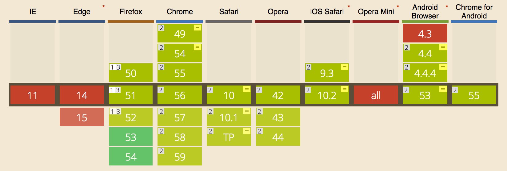
				.arrow::after {
	width: ;
	height: ;
	border-top-style: solid;
	border-right-style: solid;
	transform: rotate(45deg);
}
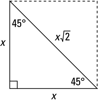
				 = 1em / 2 * sqrt(2) = .7em
.arrow::after {
	width: .7em;
	height: .7em;
	top: .15em;
	left: .15em;
}
Note that box-sizing: border-box in all examples
.parallelogram {
	overflow: hidden;
}


<div class="slider">
  <ul class="slider-list">
    <li class="slider-item"></li> /* x6 */
  </ul>
</div>
.slider {
	overflow: hidden;
}
.slider-list {
	display: flex;
	width: ;
}
.slider-item {
	width: ;
}
 = 100% * 6 = 600%
 = 100% / 6 = 16.666%
.slider-list {
	transform: translateX(-);
}

 = N * (100% / 6)

.rhombus {
	/* webkit */
	clip-path: polygon(50% 0%, 100% 50%, 50% 100%, 0% 50%);
}
.rhombus {
	/* moz */
	clip-path: url(#rhombus);
}
<svg width="0" height="0">
	<defs>
		<clipPath id="rhombus">
			...
		</clipPath>
	</defs>
</svg>

Presentation created using
 Shower